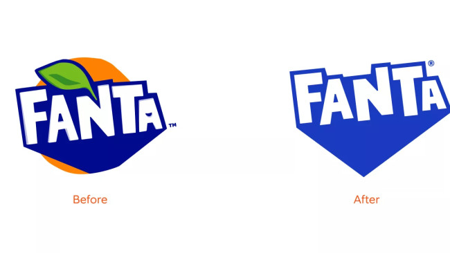
Fanta has dropped its long-time logo in exchange for a new design unifying its global identity built on fun.
The rebrand, led by Coca-Cola's design team and creative agency Jones Knowles Ritchie, hoped to make the brand's image more playful through punchy and versatile typography.
View this post on Instagram
According to Coca-Cola's Global Vice President of Design Rapha Abreu, it was clear that one of the most playful brands in its portfolio "needed some TLC."
"The identity was too contained and didn't portray playfulness," Abreu explained in an interview with Dezeen.
"At the same time, it felt geared towards a younger audience – our audience is anyone that is playful at heart, and it was important that we brought the idea of fun and play to an older audience," he added.
Throughout its multiple iterations over the years, Fanta's logo kept touches of orange, with a leaf accented over its brand name.

In the new logo design, the orange motif and smile-shaped icon on the letter A were dropped altogether. At the same time, the lettering has been simplified to look appealing when slapped against different colors from different Fanta flavors.
"[It] was confusing to have an orange in it when we have a range of flavors beyond orange. So we didn't want the other flavors to be compromised even though we know that orange is the most iconic flavor," Abreu explained.
A new look AND new Fanta Orange taste has landed‼️ It’s our orange-est era yet. 🍊 Drop an emoji with your reaction. 👇 pic.twitter.com/jby9TIVRB2
— Fanta (@fanta) February 23, 2023
According to Abreu, the new logo will be used in Fanta products across all countries to streamline its different brand identities in other regions.
"We decided to re-define for every market and ensure every team was applying the same elements so that we could truly unify under one global identity," he shared.
"We needed to crystalize it under one identity and stick with it for years. However, it was also about evolving what people love and know about Fanta. He added that we didn't want to throw away the old identity; we wanted to build upon it.
Lisa Smith, ECD Global of Jones Knowles Ritchie, also shared her thoughts on the new redesign. "We were really inspired by the idea of bringing playfulness to consumers of all ages when we started to ideate around bringing the brand's purpose to the masses," she explained.
Fanta started as a Coca-Cola alternative in 1940 before being redeveloped in Italy in 1955.
Sue Murphy, Senior Director of Design at The Coca-Cola Company, gave her thoughts on how the brand identity has changed since its launch.
"Fanta's identity, particularly the logo, has evolved significantly from the 1940s to today. With this refresh, we aimed to crystalize each element of the brand to be bold and iconic so that we could ensure it would stand the test of time and be recognized around the world," she said.


